Building a Scalable Design System for a National Education Platform
SENAI is one of Brazil’s largest technical and professional education institutions. Despite its academic relevance, its digital ecosystem lacked consistency, accessibility, and cohesive user journeys across platforms.
I joined the project as part of a product design team with the mission to modernize the digital experience and create a unified design system capable of scaling across multiple platforms.
Client
Client
SENAI
Team
Team
3 Product Designers
1 Product Manager
Industry
Industry
Education
Duration of the project
Duration of the project
6 months
Challenge
The digital products had been built in silos over time, resulting in:
Inconsistent visual identity across platforms;
Fragmented navigation patterns;
High cognitive load for students;
Poor accessibility and mobile performance;
Lack of scalable design documentation.
The core question became:
How do you bring unity to a system that was built in silos?
How do you create something innovative without compromising clarity or accessibility?
Our mission was clear:
How do we unify a fragmented ecosystem while ensuring accessibility, clarity, and scalability?
Where We Started
We initially explored a bold, glassmorphism-inspired visual direction aligned with SENAI’s innovative positioning.
This exploratory phase allowed us to test aesthetic boundaries and define early system components.
However, this direction was based primarily on internal assumptions rather than validated user needs — a gap we later addressed.
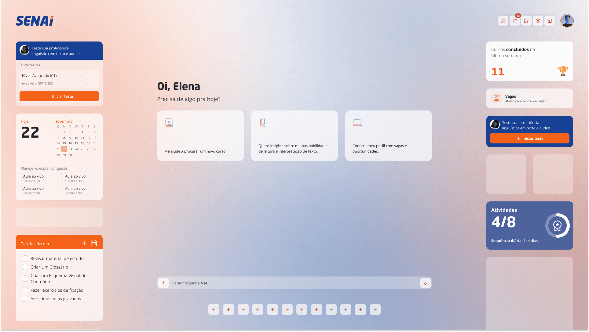
Initial concept of the Home Screen, inspired by Glassmorphism.
Initial concept of the Home Screen, inspired by Glassmorphism.
Design System Foundation
To ensure consistency across all digital products, we translated our design principles into a robust and scalable design system that balances innovation with usability.
The foundations we established include: Color system, Typography scale, Grids, Spacing, Elevation, Holographic and glassmorphism elements.
While this section highlights colors, typography, and spacing tokens, the system also integrates these other elements seamlessly to create a cohesive, modern, and user-friendly digital experience.


Design Tokens
Here, you can see examples of some of the components I was responsible for designing and documenting to ensure consistency across products and support a wide range of user interactions.
Here, you can see examples of some of the components I was responsible for designing and documenting to ensure consistency across products and support a wide range of user interactions.


Tooltips and Toggle Buttons (light and dark mode)
Tooltips and Toggle Buttons (light and dark mode)


List Section Items and Select (light mode)
List Section Items and Select (light mode)
List Section Items and Select (light mode)
Research & Reality Check
After internal approvals, I led a series of user interviews with students from different regions, socioeconomic backgrounds, and levels of digital literacy.
Key insights:
Most students accessed platforms via mobile devices;
Internet connectivity was often unstable or slow;
Visual impact was appreciated, but clarity and speed were prioritized;
Inconsistent navigation created stress and confusion.
I synthesize findings into personas and identified clear usability pain points. This research fundamentally shifted our strategy and redefined our design priorities.

Name: Sofia Martins
Age: 19
Location: Small rural town in the interior of Brazil.
Background:
Sofia is a determined young woman pursuing her higher education while navigating significant technological and geographical challenges.
Living in a small town with limited internet infrastructure, she has developed remarkable resilience and adaptability in her academic journey.
Digital and Educational Challenges:
Intermittent and slow internet connectivity.
Must travel considerable distances to attend in-person classes.
Experiences significant stress from navigating multiple inconsistent online learning platforms.
Witnesses her colleagues struggling with similar technological barriers.
Personal Characteristics:
Highly motivated to complete her studies
Introverted but deeply empathetic toward classmates’ struggles.
Hesitant to ask for technical support but quick to help others.
Aspirations:
Complete her degree.
Use her education as a pathway to better opportunities in her region.
Pain Points:
Inconsistent platform designs create cognitive load.
Fear of missing important information due to technical barriers.
Limited institutional support for students with connectivity issues.
Representative persona created from insights across interviews.
Representative persona created from insights across interviews.
Pivoting with Purpose
The feedback was undeniable: while visually striking, our initial glassmorphism concept didn’t scale well and wasn’t aligned with user needs.
We hit pause, reassessed, and shifted direction (away from decoration and towards function). What followed was a period of intense iteration and cross-team communication.
We simplified components, improved contrast and spacing, and aligned everything to a single principle: design should serve the user, not the other way around.
Collaboration & Process Improvements
One of the biggest lessons from this project was the importance of early alignment.
We improved:
Stakeholder communication loops;
Cross-team documentation clarity;
Iteration cycles based on user data rather than internal assumptions.
One of the biggest lessons from this project was the importance of early alignment.
We improved:
Stakeholder communication loops;
Cross-team documentation clarity;
Iteration cycles based on user data rather than internal assumptions.
Outcomes
Although the full implementation phase was not completed due to internal restructuring and project budget discontinuation, the project delivered:
A validated research foundation;
A structured design token architecture and documented component library ready for cross-platform implementation.
The groundwork created a more mature, data-informed product direction for future initiatives.
What I Learned
Innovation without validation creates risk.
User research must inform visual direction early.
Design systems are not just UI libraries — they are alignment tools.
Accessibility and clarity are strategic decisions, not visual constraints.